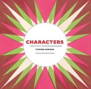
Since then, more recent reads have included Old Vintage Melbourne by Chris Macheras*; Grave Tales: Melbourne Vol.1 by Helen Goltz & Chris Adams; Adrift in Melbourne - Seven Walks with Robyn Annear; and Northside - A Time and Place by Warren Kirk, so you could say there's a little bit of a Melbourne history theme going on. And I hope you still remember my fond review of Christmas in Suburbia by Warren Kirk.
Fortunately my library had a copy of Characters and I eagerly set out with a keen eye to learn more.
Banham takes the reader on a visual and typographic exploration through Melbourne over time, covering signage, advertising, architecture and design.
Many of the stunning photographs included were taken by Warren Kirk** and reveal storefronts, shop sides and skylines long lost from view. A variety of advertising was discussed and there was a constant relationship between typography, signage and design being reinforced in the book. I particularly enjoyed this quote a little more than half way into the book:
"What does typotecture tell us? Above all, it indicates an architectural commitment to permanence, both civic or commercial. Such investment is now rare. We live in the era of privatising civic infrastructure, corporate headquarters readily moved for economic advantage elsewhere, while the constant renaming of sports stadiums and other large infrastructure reflects the transient nature of sponsorship deals. And with the passing of this age of permanence, signage and architecture forms become more temporary, portable or even modular in nature. What the readymade tilt-slab wall is to architecture, vinyl lettering is to signage. Both indicate an economic reluctance to invest in a longer-term sense of place. And with this goes a sense of collective memory." Page 189Some notable inclusions in the book were the Coles Book Arcade (I never tire of hearing about this infamous store and relished the new info here) and I loved the section on the many public clocks. Naturally the Nylex clock and the Dimmey's clock were mentioned alongside historical photographs, and I was surprised to learn the floral clock on St Kilda Road has been around since 1966. I thought it was much younger than that.
Banham revealed new typography I'd never noticed, like the zigzag of M's along the Myer glass awning in the Bourke Street Mall and I'm sure I'll be more observant now having read this book. Thanks to Nick Gadd, I appreciate the appearance of ghost signs and watching the demolition of a brick building recently, continue to wonder at the 'hands who laid or made them'.
Many of the signs and locations mentioned were within easy walking distance of where I live, including the NGV and the Shrine of Remembrance, and I especially enjoyed learning about the red bracket on the Melbourne Recital Centre in Southbank.
The chapter entitled Absence contemplated the evidence left behind when signage is removed, and how you can often still see the ghost of the message that once occupied that space. I couldn't see the beauty in the photographs included as they represent failure, change and the impermanence of things to me. The author talks about erasure and renewal and it's a process within cities that's painfully evident in the struggle to retain our heritage buildings.
I will say Characters - Cultural Stories Revealed Through Typography by Stephen Banham is more about signage, advertising, architecture and design than it is typography, but I didn't mind one bit. If you're interested in history, social history, architecture, advertising, signage or design, this is for you.
Highly recommended!
* A follow up to Old Vintage Melbourne entitled Old Vintage Melbourne 1960 - 1990 by Chris Macheras is coming out in October 2022.
** Warren Kirk has a new book coming out next month, a copy of which is on its way to me right now and will be reviewed here soon.


