I see many book covers during the course of my day while browsing publishing catalogues and answering emails or during my leisure time perusing GoodReads and other bookish blogs and online haunts. In my digital and bookshop travels, I often notice similar trends in cover design. Sometimes a book cover will remind me of other covers and I thought it would be interesting to collate and share a couple of them here just for fun.
You should know I haven't done any research on whether these covers were designed by the same designer, released by the same publisher, or indeed which book was released first. This is just a surface level observation on cover trends in the publishing industry.
Firstly, these silhouette covers were the starting point for this recent bout of similarities. These titles are:
Jane In Love by Rachel Givney,
Followers by Megan Angelo and
The Body Politic by Brian Platzer.
 |
| L-R: Jane In Love by Rachel Givney, Followers by Megan Angelo & The Body Politic by Brian Platzer |
The next pair of titles (
Above the Bay of Angels by Rhys Bowen &
Akin by Emma Donoghue) grabbed my attention due to the archway on the cover. I'm certain there's another recent release with this feature too but I can't seem to remember it. If you know what it is, please let me know in the comments section and put me out of my misery.
Akin is on my TBR so I'll be getting to this in due course.
 |
| Akin by Emma Donoghue & Above the Bay of Angels by Rhys Bowen |
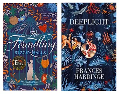
I thoroughly enjoyed
The Foundling by Stacey Halls whereas
The Lie Tree by Frances Hardinge has been on my TBR for sometime, so I noticed when her new release was published. The similarities between these two stunning covers (
The Foundling by Stacey Halls and
Deeplight by Frances Hardinge) was striking and instantly appealed to me.
 |
| The Foundling by Stacey Halls & Deeplight by Frances Hardinge |
Finally, I wanted to share an example where the primary image chosen formed the basis of the similarity. In this case, the sardine tin featured on the bestselling cover of
Normal People by Sally Rooney shows up in a re-release of
Invisible Yet Enduring Lilacs by Gerald Murnane.
 |
| Normal People by Sally Rooney & Invisible Yet Enduring Lilacs by Gerald Murnane |
What do you think of these covers? Do you think one is more reminiscent of another? Do you notice trends in cover art within certain genres? It's well known that certain genres have distinct cover designs that are supposed to attract readers who love that specific genre. I haven't included any from the crime genre but trust me, there are plenty of examples.
Sometimes these cover similarities might speak to readers about what the book contains in a 'if you liked that, you'll love this' kind of way. At any rate, it's something I will no doubt continue to take notice of and might choose to share again in the future.
Carpe Librum!


How funny! I love seeing trends like these examined. I once wrote a post featuring a heap of Australian novels that had the same cover model.
ReplyDeleteThanks Theresa, glad you enjoyed this one. I don't remember your post about the same cover model though, so feel free to link it below so we can go and check it out.
DeleteSilhouettes and those arches really are on a lot of books right now, aren't they, Tracey? I see similarities all the time, but can't think of any off-hand. I shall have to make some notes. :-) Great idea for a blog post!
ReplyDeleteThanks Debbie, so glad to hear you notice these similarities too. If you remember any, feel free to share them below or if you decide to write your own blog post, let me know in the comments :-)
Delete